Jonathan Andre is a lead ABAP developer at IT Partners. Jon is also the President of Andre Technical Consulting LLC located out of Centreville, Virginia. Jon has over 6 years experience with SAP, with a concentration on ECC SD, MM, and IS-OIL modules. Jon’s focus has been in the areas of ABAP OOP and ABAP Web Dynpro. He can be reached at [email protected]
During our previous Slipstream Engine blog, we covered some of the inherent benefits that the Slipstream provides when accessing SAP through mobile platforms, while also pointing out some of the shortcomings that require a finer tuned approach. To address those shortcomings and build a more complete mobile user interface, the suggested approach is to use the Slipstream Engine in conjunction with Adaptive Flavors. By utilizing these methods, end user can be presented with a user experience that feels both customized to how they use the system and the devices they use the system upon. This blog will discuss how to create Adaptive Flavors and access them through a mobile device.
To demonstrate how to create an Adaptive Flavor, we will be using a variation of the Screen Personas Flavor that was created during the IT Partners original SAP Screen Personas blog series. If you have not yet viewed this blog, please read Going Mobile with SAP Screen Personas – Part 1 and SAP Screen Personas : Scripting for Automation.
OK this brings us to the first major point about SAP Screen Personas and the Slipstream Engine. It’s always best to create Flavors, whether original or Adaptive, within the Framework in which they will be displayed. The Slipstream Engine and Web GUI render pages in different ways with entirely different layouts. While a Flavor created using the Web GUI as a starting point may display in the Slipstream Engine and vice versa, there is no guarantee it will appear the same or operate the same in another framework.
For purposes for this blog, although it appears to be very similar, and entirely new Sales Order Specialist dashboard was created from scratch in the Slipstream engine, incorporating all original functionalities that appeared in the dashboard from the original series, lets take a look…
Here is the Dashboard we created from a previous Blog in a Non-Adaptive Flavor viewed in the WebGUI.
Now lets take a look at the same screen as it would appear rendered by the Slipstream Engine on laptop or desktop….
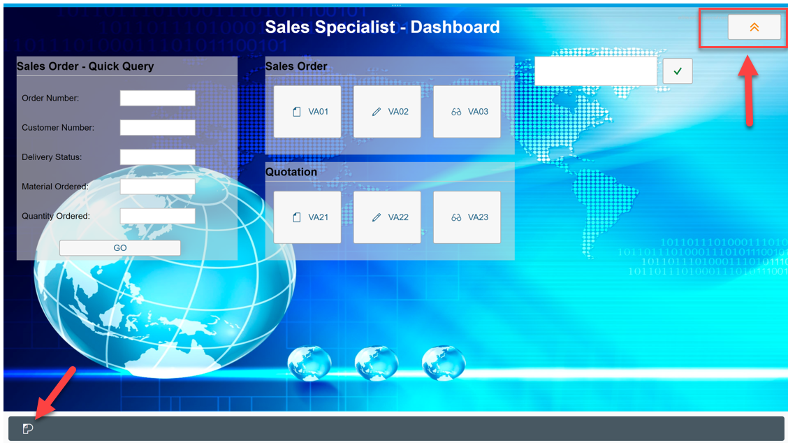
The new dashboard, when viewed through a web browser on a laptop or desktop as above, appears to be almost identical, beyond the Fiori-like task bar that appears at the bottom of the screen.
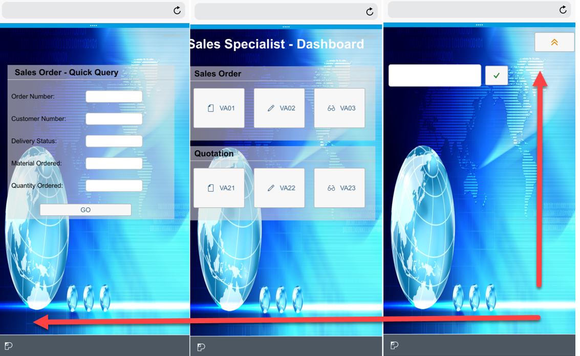
Issues arise however, when we view our Flavor from within a Mobile Device, like say an iPhone. When viewed within a iPhone, the Flavor is just too wide to fit within one screen. This causes a two-way scrollable screen, which is always undesirable and causes the end-user to feel as if they are viewing a screen built for another device…
So what can we do? We can create an ADAPTIVE FLAVOR…
To address this issue, we will create an Adaptive Flavor for our current Sales Specialist Dashboard Flavor. An Adaptive Flavor is a child Flavor which modifies the original parent Flavor’s screen elements and layout to better suit a particular screen configuration.
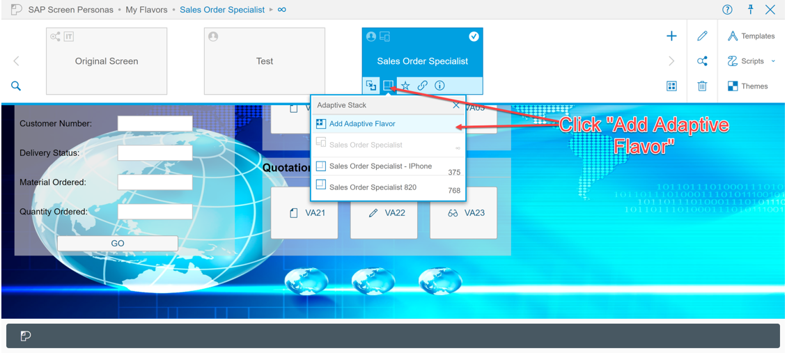
To create an adaptive Flavor, we navigate to the Personas toolbar, find the Flavor we wish to create an Adaptive Flavor for, click the “Show Adaptive Flavors” icon within the tile.
In the dropdown, we can select the “Add Adaptive Flavor” option:
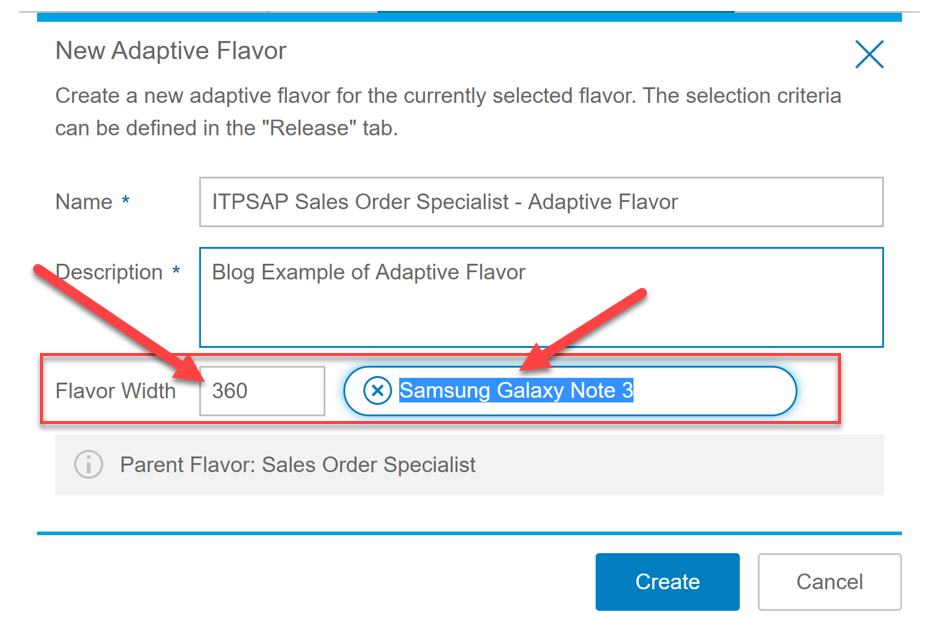
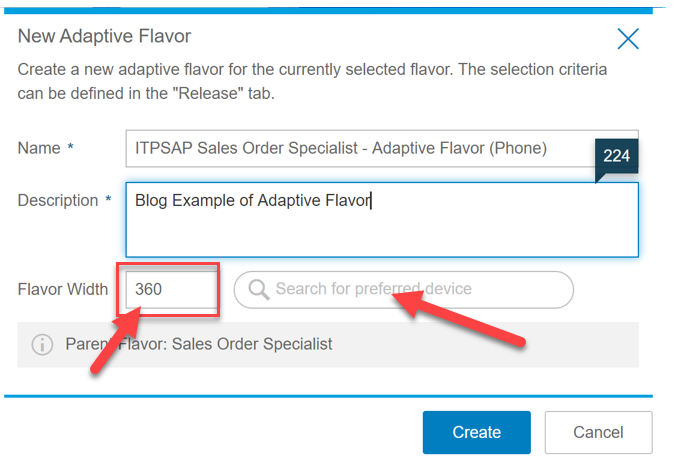
Clicking this option will prompt you to enter a name for the Adaptive Flavor, while also choosing a desired width for the Flavor. Lets set ours to a width of 375 and choose “Apple iPhone X ” as the name.
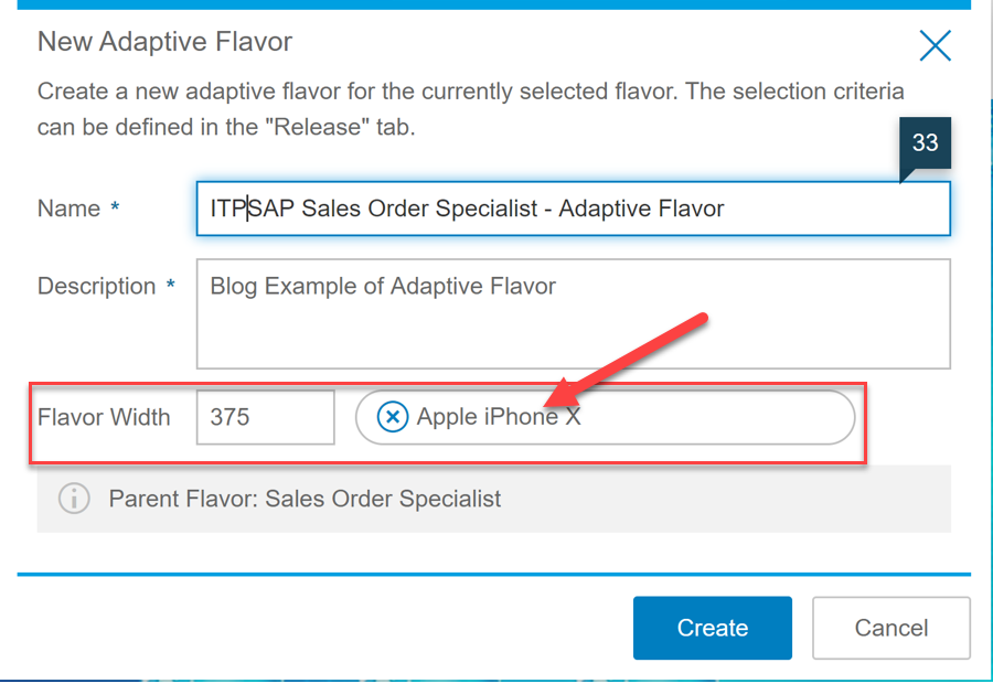
Wait… I can hear you saying I don’t know the width of my iPhone!! OK, OK, the width specification represents the MINIMUM device width in pixels that should be used for the current Flavor (this is an important point, more on this later). Many users would probably not know their own device(see I can hear you), much less the width of the wide range of devices available on the market. Fortunately, SAP provides a list of devices to choose from, and will populate the width of any particular device for you based on your selection. For instance, if we decided that we want the width of the Flavor to instead be customized for the Samsung Galaxy Note 3, a width of “360” pixels is automatically populated
Following this approach, we can easily specify the perfect width match for any particular device. We could then adjust our parent Flavor to better suit that screen size/ device in our Adaptive Flavor and our job would effectively be complete. However, unless you are certain every end user will be using the exact same device (or one with similar specifications) this may not be the best option! Which leads us to the second important topic for this blog….
 Choose Your Adaptive Width Carefully
You may be tempted to create separate Flavor for each and every mobile device out there to appease your end-users. However, screen sizes and configurations change so rapidly in the mobile device industry that this may be an exercise in futility. Instead, focus on the fact that the Adaptive Flavor width is a minimum required width!
What this means is that, when the Slipstream attempts to find the best Adaptive Flavor to fit your device, it will search for the Flavor with the largest minimum width for which it is qualified to display. Let’s explore a couple of hypothetical examples to see how this might work.
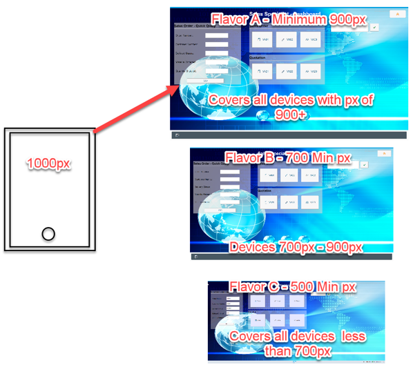
For our examples we have three Adaptive Flavor versions created for different screen widths:
- Adaptive Flavor A – Minimum of 900px
- Adaptive Flavor B – Minimum of 700px
- Adaptive Flavor C – Minimum of 500px* (Even though there is a “minimum screen size of 500px”, this Flavor still serves as the screen for devices even smaller than 500px because it’s the smallest screen size)
Example 1. Flavor is accessed with a device that is 1000 px. Flavor A is selected
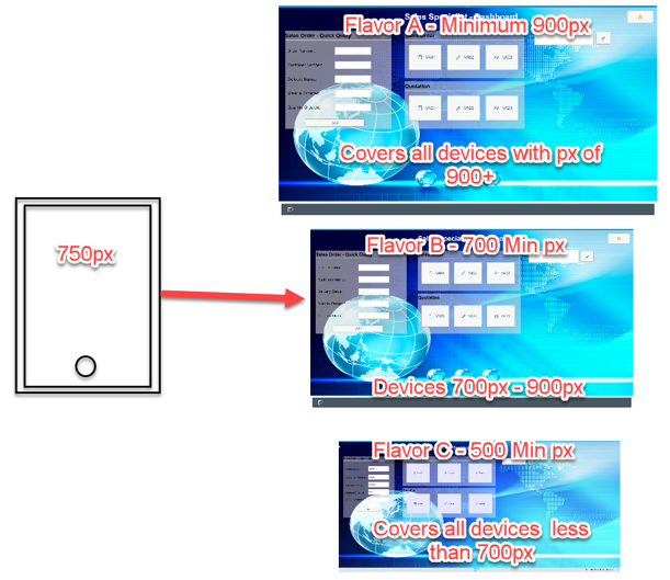
Example 2. Flavor is accessed with a device that is 750 px. Flavor B is selected
Example 3. Flavor is accessed with a device that is 550px wide. Flavor C is selected
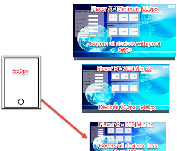
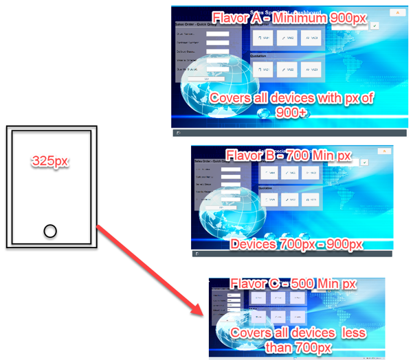
Example 4. Flavor is accessed with a device that is 325px wide. Flavor C is STILL selected, even though its minimum screen size is 550px
With just three Flavors, we can provide for four (and potentially many more) devices without needing to create individual Flavors for each type of device.
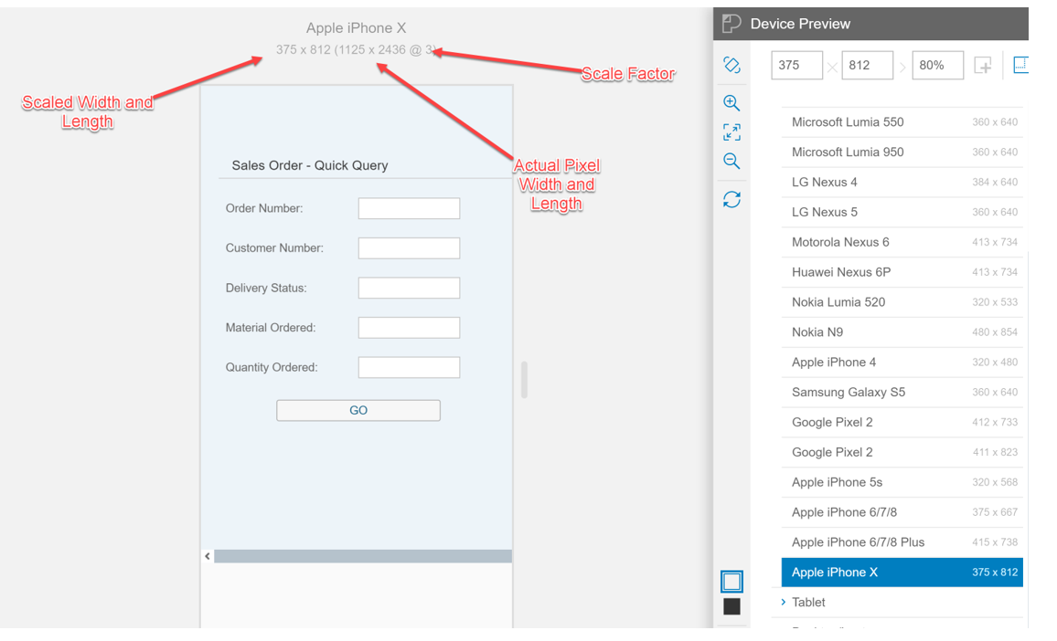
Wait! Not My Screen Size… One more detail that people may notice is that the screen width in pixels doesn’t actually match the specifications for their phones. For example, the Apple iPhone 6 and the iPhone X seem to have the same screen width, even though the iPhone X has almost twice as many pixels. Both devices, however, are listed as having a width of 375px. This is because the screen images are scaled and not actually being filled pixel by pixel. The more pixels a screen has relative to the physical screen size, the more scaling that will be performed to determine its “width”.
In consideration of that, it would be best to take note of any potential devices that may be used and the effective widths the Personas assigns these devices. This bit of information should be known before deciding on Flavor Minimum widths to ensure that Flavors are designed with their perspective devices in mind.
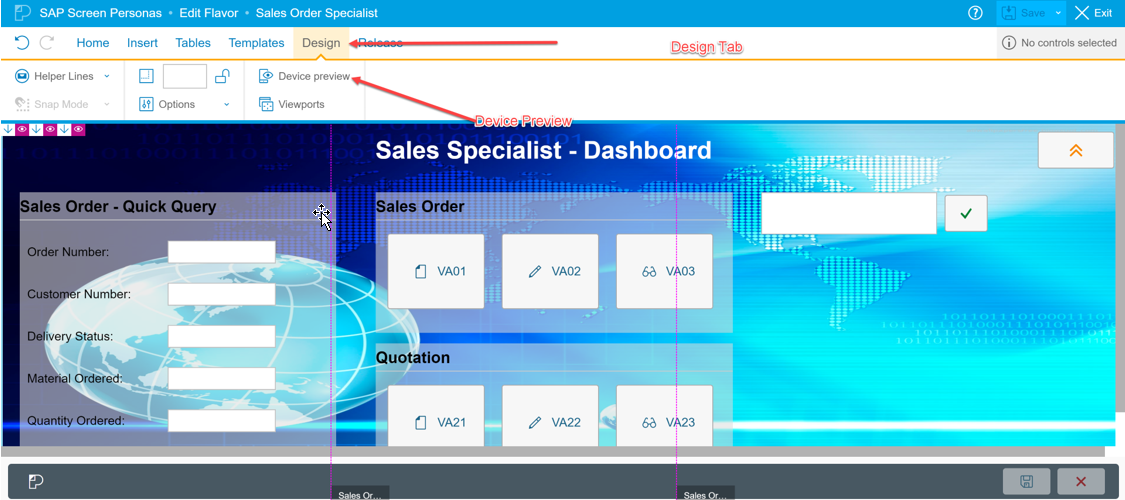
The “Device Preview” is a good place to start when gathering this information. This shows the width’s assigned to many popular phones and tablets, in addition to the scaling assigned to any particular device. The Device Preview feature can be found by entering edit mode an any Flavor (including the parent Flavor), navigating to the Design Tab, and hitting the Device Preview button. When determining the minimum screen width, you would use the “Scaled Width”, and not the actual pixel width:
Now that we’ve got those two important points out the way, we can resume designing our first Adaptive Flavor.
For this initial Adaptive Flavor, we will be targeting the portrait mode of most modern-day phones. To accomplish this, while also not creating a Flavor that will leave too much space unoccupied, we will create the Flavor with a width of 360 pixels, Please note I have manually entered the size of 360 and have NOT chosen a predefined template for a preferred device.
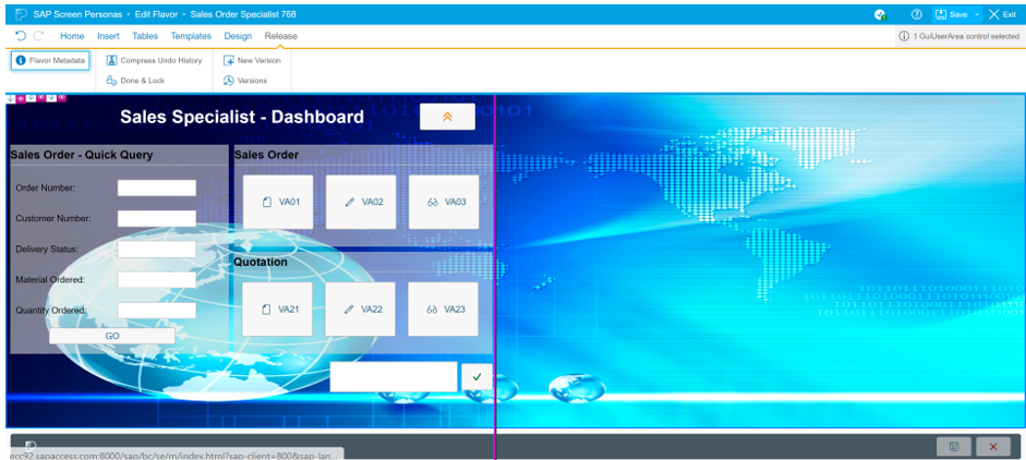
Once create is clicked, we are brought to a normal Flavor editor screen, with the parent Flavor displayed for us. The process of creating and Adaptive Flavor from this point is almost identical to creating a normal Flavor. The only difference with the Adaptive Flavors is that we see the “Helper Line” which shows us where the minimum width for the current Flavor cuts off. In other words, we can be guaranteed (except in cases where this is the smallest flavor) that all devices will have at least enough screen space to display screen elements up to this helper line.
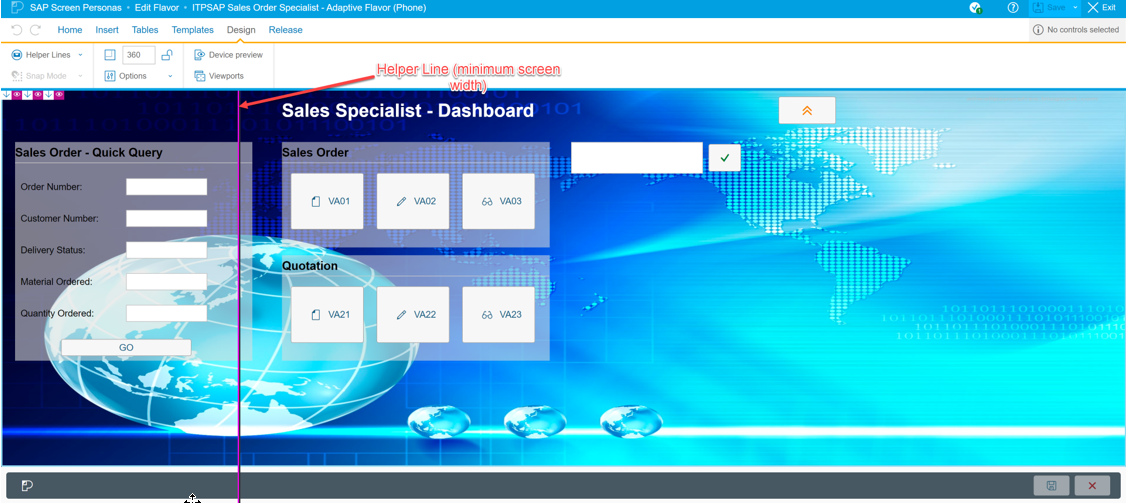
From here, in the simplest of scenarios, the goal would be to simply adjust the current Flavor until we arrive a point where all screen elements fit to the left of the helper lines. A few moves and resizes later, we arrive at a final flavor that looks like this (photo has been slightly edited to fit all within one screen).
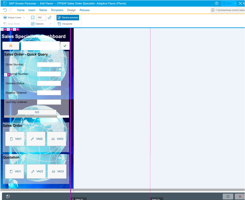
To check how this Flavor would appear on a particular device, we can again navigate to the Device Preview, the location of which was already described earlier in the blog. Once we are satisfied, we can hit save and exit and our Flavor will be activated and usable.
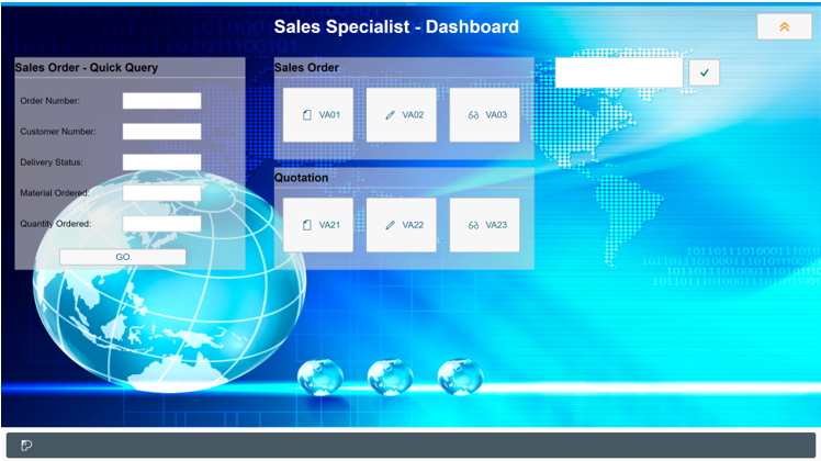
Next, we will repeat the steps outlined above for the phone Flavor to create a separate Adaptive Flavor for tablet devices. For this, we will use a minimum pixel width of 768 pixels, rearrange our screen, and end up with a second Adaptive Flavor that looks like this…
As a final configuration step, we return to the original Parent Flavor, navigate to the “Design” tab, and we set the minimum width to 1000px. With this final change, we have the three tiers we require for the 3 different types of devices:
- 1000px and above – Parent Flavor
- 768-1000px (tablet) – Tablet Adaptive Flavor
- 768px and below – Phone Adaptive Flavor
Note that, while we chose these three tiers for this blog, this is by no means a requirement. If you or your user base is unhappy with the appearance of the Flavors, you can create as many Adaptive Flavors as you need.
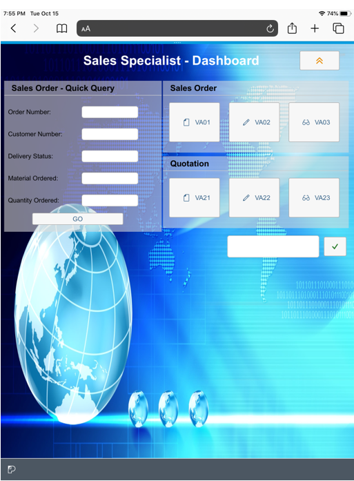
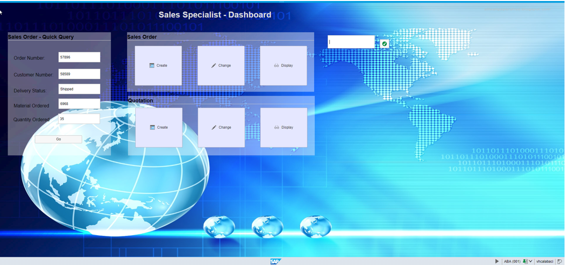
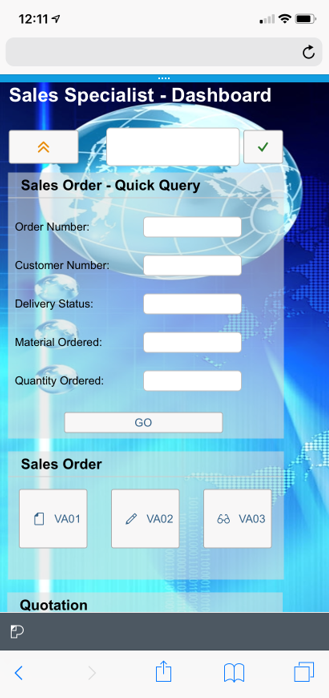
Accessing our Flavor from a Phone, Tablet, and Desktop, we are met with the following respective screens…
Phone (iPhone X)
(Adaptive Flavor – IPhone (360).PNG)
Tablet (IPad)
(Adaptive Flavor – IPad (768).PNG)
And of course, the Parent flavor for the desktop…
You may be asking yourself, what about landscape mode? What happens if a user flips the device? I told you I can hear you… 😉
This is something Flavor designers did not previously have to be concerned with when working with desktop versions. However, users expect that mobile interfaces will automatically adjust when rotated. It may come as a surprise that, for many phone dimensions, this has already been handled with the Adaptive Flavors created already! That is because the Adaptive Flavors consider the rotation of the mobile device to be just another screen width, except this time the length has become the width and the old width has become the new length.
Lets take the Apple IPhone X for example, which has the scaled screen dimensions of 375 x 812. In portrait mode, the IPhone will adjust to the 360-pixel phone Flavor, which you can see above.
However, when we rotate the IPhone to landscape mode, the IPhone will automatically switch over to the Flavor appropriate for an 812-pixel width device. In our example, that would be the tablet display, which supports a minimum width of 768 pixels!
If the Adaptive Flavors we have currently created do not fit the landscape mode for any particular device, we could of course create a new Adaptive Flavor to accommodate. Generally though, addressing landscape mode is no different than creating a Flavor for portrait mode. Its just another screen.
Summary
Adaptive Flavors implemented in conjunction with the use of the Slipstream engine provide users a modernized UI while requiring a minimal level of effort. Adaptive Flavors allow one initial Flavor to be reused to customize different classes of mobile devices, providing a user a UI experience that seems personalized and efficient for their needs. Even rotation from portrait and landscape modes are made easy using the Flavor designer and editor, as long as you have prior knowledge about screen dimensions. SAP, foreseeing the importance of knowing this information, has done well to make this information accessible for Flavor designers in the Device Preview as well.
In the next blog of this series, we will explore how we can simplify even the most complex transactions with the use of Viewport technology.
Cheers and Thanks for reading!


