Jonathan Andre is a lead ABAP developer at IT Partners. Jon is also the President of Andre Technical Consulting LLC located out of Centreville, Virginia. Jon has over 6 years experience with SAP, with a concentration on ECC SD, MM, and IS-OIL modules. Jon’s focus has been in the areas of ABAP OOP and ABAP Web Dynpro. He can be reached at [email protected]
As we described in a prior blog The ABAP Developer Road Map to SAP HANA, with the advent of SAP HANA, there has been a paradigm shift in the way business applications are developed. The rule-of-thumb is simple: Do as much as you can in the database to get the best performance. This was coined as “Code Pushdown” by SAP. So far we have looked at CDS Views as a way to achieve Code-Pushdown in the blog Don’t Try Coding ABAP Core Data Services Without Reading This First. We have also exmained AMDP, a different “Code Pushdown” pattern to improve performace in the blog Want to Avoid HANA AMDP Mistakes? READ THIS. We can all agree that speed is a definite factor in the user’s enjoyment when using the SAP system, but what about the screens or transactions themselves?
In this blog we will start to look at the User’s experience and how SAP is re-inventing it. SAP defines the User experience (UX) as meeting the user’s needs in the most effective and enjoyable way. SAP’s UX strategy is built upon the foundation of our user’s goals —efficient and easy-to-use software, packaged with the optimal user experience. SAP believes that along with the massive performance improvements HANA and “Code Pushdown”, the User’s experience must be optimized and peronalized. So why target and tweak the UX?
Why SAP needs a NEW UX Strategy
The SAP business software has evolved over the years to facilitate a wide range of business processes across multiple industries. In order to accommodate it’s diverse user base, SAP has constructed highly modular and increasingly complex transactions to fulfill the many varying business scenarios. This has presented a problem where, regardless of a user’s job functions, all users are presented with the same transaction screens. This often creates a scenario where users are presented with more tabs, fields, and screens than are required for their day to day activities. This not only has an impact on the number of errors inputted, but it also increases the training time required to acquaint new employees with the system.
Realizing this problem, SAP has reinvented the overall UX (user experience) across the suite of SAP systems. For new applications, SAP has created the Fiori UX as its modernized, cross-platform user interface. For existing applications, SAP has created the Screen Personas framework which allows users to personalize the existing SAP experience. Over the next few blogs we will introduce the Screen Personas framework (SAP Screen Personas 3.0 in particular) and give a basic overview on how users utilize this framework themselves.
What is SAP Screen Personas?
SAP Screen Personas is a UI framework that allows existing SAP GUI transactions to be “modified”, permitting users to add, edit, or remove screen objects to be better suit their business functions. New versions of transactions created within SAP Screen Personas are known as a Flavors, and each transaction can have multiple Flavors to suit different user’s needs. A Flavor can be thought of as an overlay on top of the standard existing transaction screens. Flavors have access to all fields on the standard SAP screen and can pick which fields and tabs to display and how to display them. Flavors can also generate additional fields and display them statically or dynamically using scripting. Users have the option of creating new Flavors from scratch or downloading an existing Flavor from SAP’s online Flavor gallery.
SAP Screen Personas Basics
All interaction with the Screen Personas framework is performed within the Screen Personas bar. This bar sits at the top of the screen the standard GUI screen in a collapsed form when Personas is enabled:
By expanding this bar, the user is presented with a few options. Basic users would simply choose between the Flavors available for the current transaction. The standard transaction view can always be returned to clicking the “Original Screen” Flavor button.
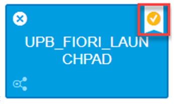
Clicking a different Flavor tab causes that Flavor to be instantly loaded. If a user has a preferred Flavor, they can assign that Flavor as the default by clicking the Check Icon in the top right corner of the Flavor.
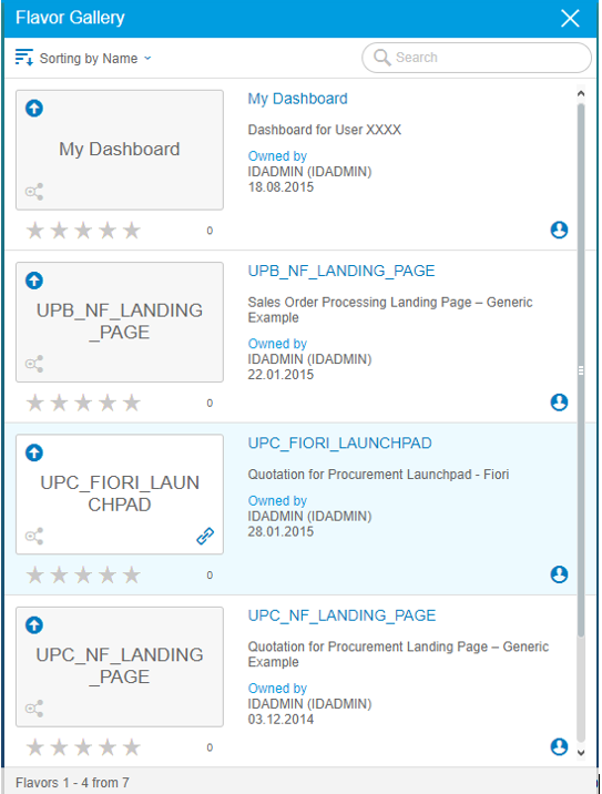
Users can also browse and load other existing Flavors by navigating to the Flavor gallery. If users find a Flavor they like, they can add it to their own collection by hitting the UP icon in the top left corner of the tile.
Within the Flavor Gallery, users can find and add Flavors to their personal Flavor collection and follows steps above to either display or default that Flavor.
The SAP Screen Persona Dashboard
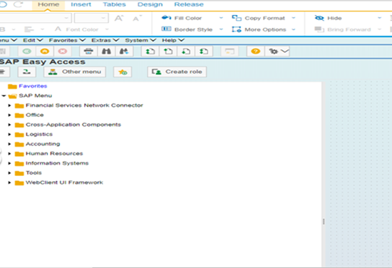
Like all other Flavors, the SAP Screen Personas Dashboard is a Flavor applied to an existing SAP transaction. In this case, the Flavor is applied to the SMEN transaction that is automatically loaded when a user logs into the SAP system. What does that look like? OK, below is the standard SMEN screen.
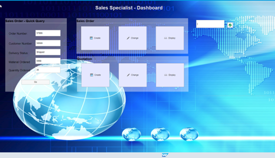
Now, below is the SAP Screen Persona Dashboard…
It is common to place Transaction buttons to the Dashboard, allowing quick and easy access to the most used transactions. It is also common to allow users to retrieve certain information using scripting and customs fields. Instead of navigating to particular transactions, users are able to click script driven buttons that will go to the transactions, grab the desired information, and display the information right on their dashboards. This saves the time required to navigate for the user, as well as removing the need for the user to learn the complexities of yet another transaction.
In addition to the functional changes listed above, it is also possible to apply a stylistic change the look and feel of the Dashboard. The above examples show that the dashboard is vast departure from the classic SMEN transaction. End users who experience Persona often do not realize they are still working with an SAP system, and often appreciate the updated feel. Now, granted, I’m not an artist… but
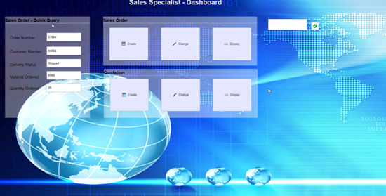
Now, granted, I’m not an artist… but lets look past my attempt at a cool looking screen and see the real value here… This dashboard is organized around a “Sales – Specialist”. Going back to what SAP defined as their UX strategy…
It becomes easy to see how as a Sales Specialist I could really appreciate the highly personalized layout of what I need to do my job, especially if I have the ability to customize it! Also, consider how easy it would be to train a new Sales Specialist.
That said, some business functions are too complicated to cram into the dashboard itself, and therefore still require navigation to a transaction. Fortunately, these transactions themselves can also be simplified to show only the information important to the current user. This can be accomplished by eliminating certain tabs and fields, merging fields from up to three tabs together (however, SAP suggest no more than three!), and auto populating other fields. Just these three tasks can greatly reduce the complexity of many transactions, as will be illustrated later in the blog. In addition, users can switch between predefined Flavors that are best suited for the job they are currently doing. This way, they can always have the best perspective to perform the task at hand.
Creating a Personas Dashboard from Scratch
Next, we will design a mock scenario where we will create specialized Flavors for a mock Sales Specialist user. During this scenario, we will explore the basics of creating a new Flavor Dashboard. Afterwards, we’ll walk through how to simplify the Sales Order Create transaction.
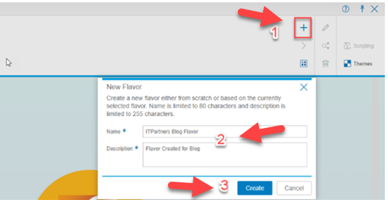
To begin designing a new Dashboard for the Sales Order Specialist, we will navigate to the SMEN transaction (or simple start our SAP system and be taken their by default). Once there, click the Screen Personas “P” icon to expand the bar. Once expanded, click on the “+”
A prompt will appear asking to enter a Flavor Name and Description. Enter a suitable name and hit create to continue.
The base template for any new Flavor (unless you opted to copy an existing Flavor) is the standard Flavorless SAP transaction. In this case, the Flavor will look like the basic SMEN transaction.
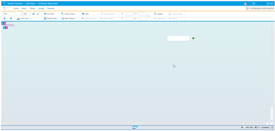
After creating a new Flavor, the Personas screen will automatically enter into edit mode. While in edit mode, a new function bar appears on top of the screen that will allow users to customize the Flavor.
Understanding The SAP Screen Personas Flavor Editor Tabs
Before continuing with the design of our Dashboard, here is a quick overview of the major features offered by the Screen Personas Flavor editor…
The Home tab allows users to edit the appearance screen elements. Fonts, font sizes, and font colors can all be edited here. In addition, fill colors, transparency, and background images can be added to Flavors to give a more polished look or add a company logo. The Group functions allow related fields and labels to be grouped and modified as one object. This is useful if you don’t want to click every element of a container to move or resize it.
By far the most important feature of the Home tab, and perhaps of the entire Personas editor functions, is the “Hide” button. Designers can select individual fields or entire containers and hit the “Hide” button to prevent them from displaying on the screen. Hiding a container will cause the container itself and sub-elements to be hidden as well.
The Insert tab allows users to add elements to the screen. The most important elements for Dashboards are the Transaction Buttons, which allow navigation to a specific transaction, and Script Buttons, which can be combined with JavaScript to perform certain actions (e.g. populate fields with certain values). Many of the Insert elements require scripting and Scripting will be covered in a future blog.
The Table tab allows users to simplify tables, in addition to adding some custom formatting to distinguish table rows that meet certain criteria. Information on table modifications will be covered later in the blog.
The last tab we will go over (the release tab is beyond the scope of this blog) is the Design tab. The design tab allows for the creation and importation of screen object templates. In addition, the Design tab allows users to quickly access and apply context-specific stylings (for instance in the context of a button or a field). This can quickly speed up screen design time.
Steps to Create the SAP Screen Personas Dashboard
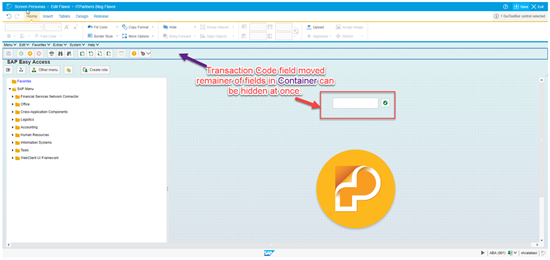
We will start designing out dashboard by hiding everything on screen except the back button, and the transaction field. To save time, we will click on specific containers and hit the “Hide” button on the “Home” tab. To make sure we don’t accidentally hide the buttons and fields we want to preserve, we will first move those out of the way into a separate part of the screen. Note that everything can be hidden, including the menu bar.
After we have hidden the container and fields…
With unnecessary buttons hidden, we will set a new background image for the dashboard. This is very helpful in giving the Screen Personas dashboard a professional feel. To set a background, select the top level container and navigate to Home->Assign Background. Background images can be selected from the provided images or uploaded.
Steps to adding Transactional Buttons
Next, we will design some transactional buttons to allow our user quick navigation. Our user will need access to the following transactions for daily activities: VA01, VA02, VA03, VA21 VA22, and VA23.
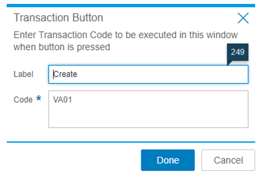
To create our transaction buttons, we navigate to the Insert tab and select Transaction Button. Once selected, a screen will prompt the user to enter display text and the desired transaction code. Our first button will be a transaction button for VA01 – Sales Order Create.
In addition to the provided description, we can add an icon by selecting our created button and clicking “Assign Icon” on the Home tab. This button is located at the same point as the “Assign Background” from our previous step. Functions within the tabs will change based on what object type is selected.
Following this process for the remainder of desired transactions, we are able to create the remainder of Transaction buttons.
We can also use Containers to logically group our buttons and allow them to be moved in unison more easily. The Container object can be located on the Insert tab. We place related buttons (Sales or Quotations) within their own containers and give each Container a label. The result is the screen below…
One Note – the “Sales Order – Quick Query” tool is a mock up and not actually functional. We will go over how to create scripts that will populate that information in a future blog. That aside, our dashboard bears no resemblance to the original SMEN transaction. It does, however, provide access to the most important transactions used by our mock user, as well as additional scripting functionality and a much more modern interface.
Transaction Simplification with SAP Screen Personas
For our next step, we will simplify one of the transactions used by our user, VA01.
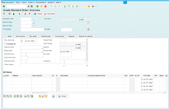
VA01 is composed of multiple screens but, fortunately, only one Flavor is required to redesign each screen encountered in the transaction. Before we begin simplifying the VA01 transaction, let’s review what the unmodified VA01 transaction looks like…
Order Type Information Screen:
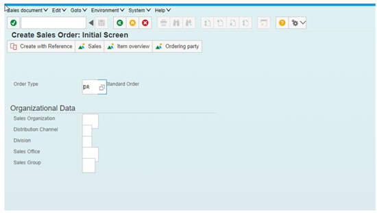
It is easy to see why the VA01 transaction can be intimidating to SAP novices. While all its functionality is useful in one scenario or another, it is rare that every field would need to be touched when documenting a single sale.
The end goal of our Flavor will be to reduce these two screens to only display mandatory fields, eliminating as many fields and tabs as possible. The process in reducing fields in a transaction is almost identical to reducing the complexity of the SMEN transaction to produce a Persona Dashboard. The difference is that, when working with transactions, we need to be careful not to eliminate mandatory fields. In addition to this, we often have separate tabs and tables to deal with, as is the case in the VA01 transaction.
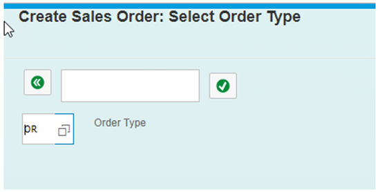
The first step in this process is to reduce the Create Sales Order: Initial Screen to as few fields as possible. To this, we will remove all fields but the Sales Order Type field, and hide all menu items except the transaction code, the back button (so we can get back to our dashboard):
Notice that we have also renamed the title of the transaction. This title more accurately represents the actions performed here, since Order Type is the only option. Any text on screen can be edited in the Personas Flavors, even title text or names of tabs that exist in the original transaction.
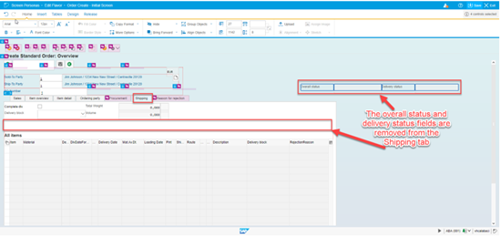
There is no need to create a new Flavor when redesigning the Sales Order Overview screen since we are within the same transaction as the Initial Screen Flavor. We follow a similar process as above, being sure to allow all mandatory fields to be displayed while hiding others we aren’t concerned about. Entire tabs can be hidden to reduce the clutter of the transaction. This is possible even if the tab in question contains a field that we would like to display. To accomplish this, we perform a tab merger, taking the fields from one tab and placing them on another.
For example, we want to display the Delivery Status and Overall Status from the shipping tab in the final Flavor, but we would like all other fields from this tab to be hidden.
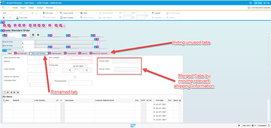
With the two fields set to the side, we can navigate to the Item Detail tab and place them there.
We also rename the tab to better describe the new information it contains.
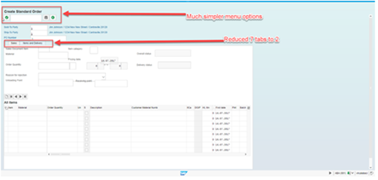
Through hiding, merging, and renaming, we are able to drastically reduce the complexity of the Sales Order Overview screen. From a starting point of 7 tabs, we are able to reduce our Flavor to only containing 2 total tabs.
Summary
SAP Screen Personas is a personalization framework integrated into the SAP GUI family. It allows IT professionals and SAP experts to simplify classic screens in SAP ERP, Business Suite on HANA, or SAP S/4HANA. Simpler screens improve the adoption of SAP software because they enable users to navigate business processes quickly and easily, leading to improved end-user productivity and satisfaction.
This, in turn, reduces training costs by making SAP more intuitive. And by reducing the number of free text entries required, you also enhance data quality.
In the next blog, we will focus on simplifying transaction screen tables.


